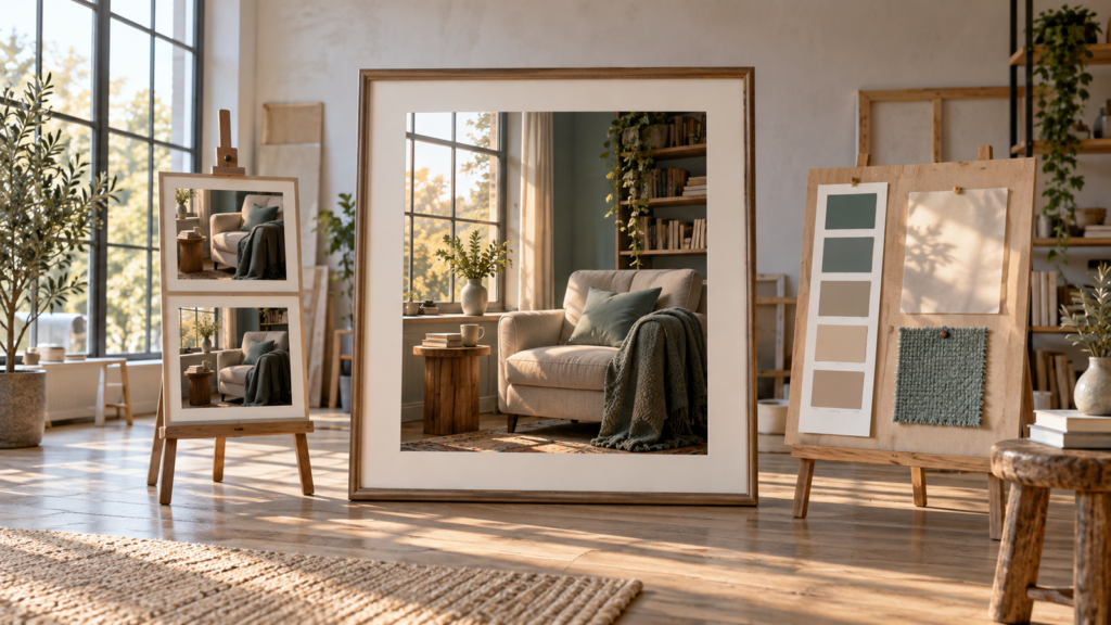
You ask “create a beautiful room” and receive a polished image, but its furniture, colors, and light are not what you imagined. A magic word was not missing: visual decisions were. Creating AI images becomes more controllable when you can describe the subject, how elements relate within the frame, where the image will be used, and which problem you want to correct after the first attempt.
This guide proposes a simple process: intention, description, generation, inspection, and adjustment. It is designed to work across generators without depending on a list of ready-made commands. Features such as references, localized editing, aspect ratios, and transparency vary by service and plan; therefore, the method separates what you can describe in ordinary language from what you need to confirm in your chosen tool.
What happens when you ask AI for an image?
You describe a scene, and the generator interprets your instructions to produce a visual composition. The first version is a proposal, not a photograph of what was in your head. When the description leaves choices open, the tool decides many details itself: object positions, lighting, the number of elements, and even atmosphere. This explains why an image can be technically attractive yet fail to serve your purpose.
You do not need to understand the system’s architecture to begin. It is more useful to learn to observe the result: is the subject clear? Does the framing suit the image’s destination? Does an invented detail interfere? Do proportions and colors help communicate the idea? With specific answers, the next instruction becomes more useful than “make it better.”
Some products offer additional features. The official documentation for images in ChatGPT describes creation, editing, uploading an existing image, and aspect-ratio options in that service. Adobe Firefly’s documentation shows references, aspect ratios, and editing in a specific environment. This confirms such features exist in certain contexts, not that every generator offers them in the same way.
Start with the main idea
Let us follow a fictional editorial example: you want an image of a cozy reading corner near a window to illustrate a page. The initial request—“create a reading corner”—communicates the subject but does not indicate which corner, where we view it from, or how the light should appear. If the result is a dark library or a room full of objects, the generator has not necessarily “got it wrong”; many decisions were left open.
A first improvement need not be long: “Create a cozy reading corner near a window, with a light-colored armchair, soft late-afternoon light, and an editorial composition.” Now there is a subject, main object, environment, and atmosphere. The light-colored armchair avoids an arbitrary color choice; the window provides a light source; “late afternoon” guides the scene’s color temperature. There is still room for the tool to propose details.
These requests are prompt-writing examples. The aim is to show how each sentence tries to resolve an uncertainty. If the first image works, stop. Adding information for its own sake can make the request contradictory or the next correction harder.
Describe subject, environment, and composition
Start by asking: what should appear, and what should happen? “A dog” leaves almost everything open. “A small dog sleeping on a blanket beside the window” defines subject, action, and spatial relationship. In a scene without people, the action can be an object’s position: a bicycle leaning against a wall, a cup on a table, a cabin in the background. Choose a few decisive details rather than a pile of adjectives.
The environment adds context. “Coffee shop” may produce very different spaces; “a small light-wood coffee shop in the morning, with light entering through the windows” defines place, material, and time. In the reading corner, you can say whether the armchair is beside the window, whether books appear in the background, and whether the space should look like a real home or an illustrated setting. You do not have to fill every field: describe only what would be missed if ignored.
Composition organizes what appears within the frame. A close-up brings the subject closer and reduces context; a wide view shows the environment. An overhead view emphasizes distribution on a surface, while an eye-level angle brings the scene closer to the experience of being there. Central framing highlights an object; moving it sideways can leave empty space for a title added later. “Negative space” simply means that less occupied area, not a defective part of the image.
In the example, if the armchair is cropped, ask for a wider frame with the whole chair visible. If the window disappears, say “armchair on the right, window clearly visible on the left.” Relationships such as “near,” “behind,” “in the foreground,” and “in the background” often help more than saying “beautiful, elegant, inspiring” three times. Still, check the result: spatial instructions can be interpreted differently.
Use lighting, colors, and style to define atmosphere
Lighting changes how the same scene is read. Soft light tends to produce gentle transitions; hard light creates pronounced shadows. Side lighting reveals texture; backlighting comes from behind the subject and may strengthen outlines but also darken the main object. “Morning” or “late afternoon” is usually enough to begin. In the reading corner, a window with soft late-afternoon light communicates calm without requiring photographic jargon.
Colors and light influence each other. A warm palette with wood and beige fabric may appear cooler under bluish lighting. If color matters, name two or three dominant tones and the desired intensity: warm neutrals, understated green, moderate contrast. “Many vibrant colors” may compete with a serene setting. There is no universal rule; the palette should serve the image’s purpose and publishing context.
Style is another decision: photography, illustration, painting, collage, drawing, and 3D rendering do not create the same expectations. “Editorial photography with plausible materials and natural shadows” suggests something different from “an illustration with simple shapes and flat colors.” Instead of relying on a living artist’s name, describe observable characteristics: visible brushstrokes, delicate lines, paper texture, warm colors, or a minimalist look. This communicates intention without asking for a direct copy of an artistic signature.
What changes when you adjust only the lighting?
To see this in the reading corner, we created the image below with neutral morning light. Then we used that same image as a reference and requested a change: warm late-afternoon light entering through the window.
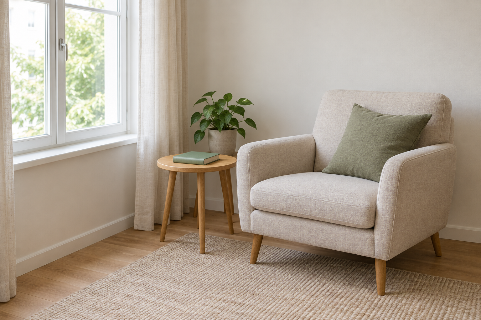
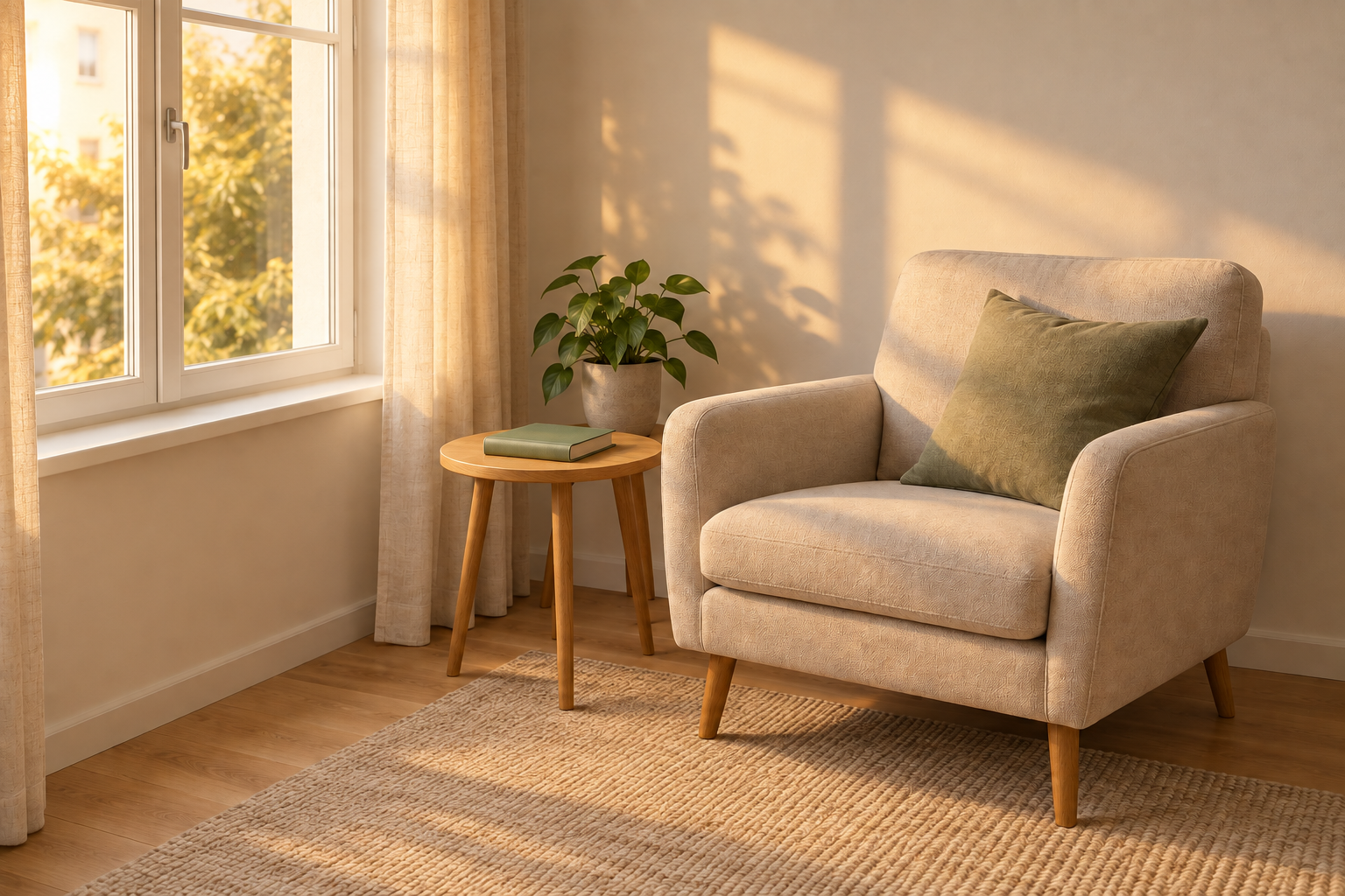
The lighting became visibly warmer, and patches of sunlight appeared on the wall, armchair, and floor. The window on the left, armchair on the right, and arrangement of the table, book, and plant remained close to the initial image. Still, some scene details varied. The tool had also added a cushion, rug, and curtains to the first image, although we had not requested them.
This is a good way to guide an adjustment, not control every detail. When editing an image, compare what changed as you wanted with what changed without being requested. If an object or position is essential, check the new version before using it.
Choose the format according to where the image will be used
Before generating, know whether the destination is a horizontal header, square post, vertical design, or thumbnail. A blog image generally needs to fit a wide strip; a story calls for vertical space. Aspect ratios such as 16:9, 1:1, 4:5, and 9:16 are common examples, not universally available formats in every service. Check your generator’s options and the dimensions required by the publishing channel.
Format changes composition. An armchair beside a window may fit well in a horizontal frame but be compressed or cropped in a vertical version. To reduce surprises, leave space around the subject and avoid placing essential details at the edges. When an aspect-ratio selector exists, use it; otherwise describe the destination and check the delivered file. Asking for “vertical” in text does not guarantee that any product will export the exact desired ratio.
For our article example, the instruction can evolve into: “Keep the entire light-colored armchair and the window visible in a wide horizontal composition, with space at the edges for possible cropping by the website.” This solves a usage problem, not just an aesthetic one. If a title will be added in another tool, reserve a less occupied area instead of depending on generated text inside the image.
Build your first prompt without overcomplicating it
Use this list as support, not a mandatory formula: subject; action or position; environment; composition; style; lighting; colors; essential details; restrictions. A short request may be enough. Add fields when the image is generic or when a publishing requirement demands precision. An instruction with dozens of competing requirements may confuse the result and make it hard to know what to adjust.
Compare the vague prompt “create a reading corner” with a more controlled version: “Create an editorial photograph of a reading corner in a small room. A light-fabric armchair is fully visible beside a window; understated books appear in the background. Use wide horizontal framing, soft natural late-afternoon light, and a palette of warm wood, beige, and subtle green. Keep space at the edges. No people, text, or logos.”
What changed? “Editorial photograph” defines the image type. The armchair, window, and books define the elements. “Fully visible” and “space” address cropping risk. Time of day and palette guide atmosphere. Restrictions avoid unwanted elements. None guarantees a perfect output: each piece of information merely reduces ambiguity. You can begin with half this text and add to it after seeing the first version.
Restrictions can be written in ordinary language: “no people,” “no text,” “no logo,” “simple background.” Not every service has a separate negative prompt field; where it does not, describe the restriction in the instruction if the generator accepts that guidance. Then inspect, because a restriction can also be ignored or applied only partially.
Generate, analyze, and adjust one thing at a time
When the image arrives, do not change everything at once. Choose the main problem: is it dark? Is the armchair cropped? Are there too many objects? Does the result look like a painting when you wanted photography? Adjust the corresponding instruction and compare. This cycle helps you understand changes’ effects even when the tool does not reproduce exactly the same scene between attempts.
Suppose the composition is good, but the reading corner is dark. An incremental request would be: “Keep the composition, armchair, and window position. Change only the lighting to soft natural light entering through the window; preserve the palette and do not add objects.” If the tool offers editing of the current image, use it. If it generates another image from scratch, the composition may change despite the instruction; in that case, try attaching the previous version as a reference if available.
A short routine helps: describe what you expected, record what appeared, choose one variable, request a new version, and compare both. If it worsened, return to the previous description and test another change. Saving useful versions is better than replacing an approved image with an attempt that is merely newer. Do not turn every adjustment into a new list of demands.
How to correct the most common problems
Generic image? Add visual context or a concrete spatial relationship. Armchair in the wrong place? Say which side of the window it should be on and request space. Too many elements? Reduce the scene to one main subject and simplify the background. Unsuitable color? Name a short palette and avoid conflicting color instructions. Wrong framing? Request a close-up, medium shot, or wide view according to use.
If strange text appears on a cover, sign, or package, do not conclude every generator is incapable of producing words. Quality varies by service, complexity, and attempt. Write the exact phrase, request revision, and check letter by letter. When precision is essential, it may be safer to generate the visual without lettering and add text later in a suitable graphics editor. The official ChatGPT Images help documents text and editing features in that product, but does not promise an absence of errors.
Also observe reflections, duplicated objects, strange proportions, and details that look plausible from a distance but fail up close. The best correction may be a localized request, manual editing, or a new generation. No command guarantees the problem will disappear. Therefore, always evaluate the final version at its intended size, including on a phone or as a thumbnail.
When to use a reference or edit an existing image
A reference image can guide composition, colors, an object, or visual identity when the generator supports it. It should not be understood as a promise of exact reproduction. The official Firefly guide to composition references describes control of proximity to an uploaded image; other tools have their own workflows and results. Use photographs and materials you have the right to share, especially when people or private content are involved.
Editing an existing image differs from requesting a new one from scratch. Depending on the tool, you may request a background change, object removal, an added detail, or a color change. Some offer region selection; others receive only text instructions. In ChatGPT Images documentation, for example, selection is described as approximate, and an edit may affect areas beyond the highlight. Treat requests such as “keep everything else the same” as guidance to verify, not a technical guarantee.
If you need to keep the same character, product, or setting across a series, references, editing the approved version, and consistent instructions may help. Perfect detail preservation across generations is not universal. For work requiring strict identity, compare every new image with the original and consider specific editing tools or stages. Do not upload a personal or third-party photograph merely for convenience when a generic description would achieve the goal.
Care with text, privacy, and image use
Before publishing, check relevant visual facts, text, brands, permissions, and context. A generated image of a person, place, or event should not be presented as documentary evidence of something that never occurred. For commercial use, check current service terms and applicable usage rights; intellectual-property rules vary by jurisdiction and tool. This guide does not replace legal guidance.
Avoid uploading private photographs, personal data, or third-party work without appropriate authorization. If using a reference, be clear about its role—color, framing, or object—and limit what you send to what is necessary. If the result includes a face, logo, or element resembling protected material, review before use. For institutional designs, retain a person responsible for final approval.
Create your first image step by step
Choose a small idea, such as the reading corner. Write a sentence with subject and environment. Add one composition decision and one lighting decision. Indicate the destination—horizontal for an article, for example—and at most two important restrictions. Generate the first version. Then record three observations: what worked, what interfered, and which change would make the biggest difference. Correct only that change and compare.
To organize elements before sending them to the generator, use the IANautaLab image prompt generator as support for subject, style, composition, and details. It helps structure the description; it does not guarantee the result. The Creating with AI hub brings together related content.
A good image does not necessarily come from a long prompt. It emerges when you know why you want each element, observe what the tool delivered, and consciously decide the next adjustment. Save the version that meets the real use, check its edges and text, and only then publish.